Data Visualization
Data visualization is an important aspect of data exploration, analysis, and communication. Generally, visualization of the data is one of the first steps in any analysis. It allows the analysts to efficiently gain an understanding of the data and guides the exploratory data analysis (EDA) and the modeling process.
An efficient and flexible data visualization tool can provide a lot of insight into the data. ADS provides a smart visualization tool. It automatically detects the data type and renders plots that optimally represent the characteristics of the data. Within ADS, custom visualizations can be created using any plotting library.
Automatic
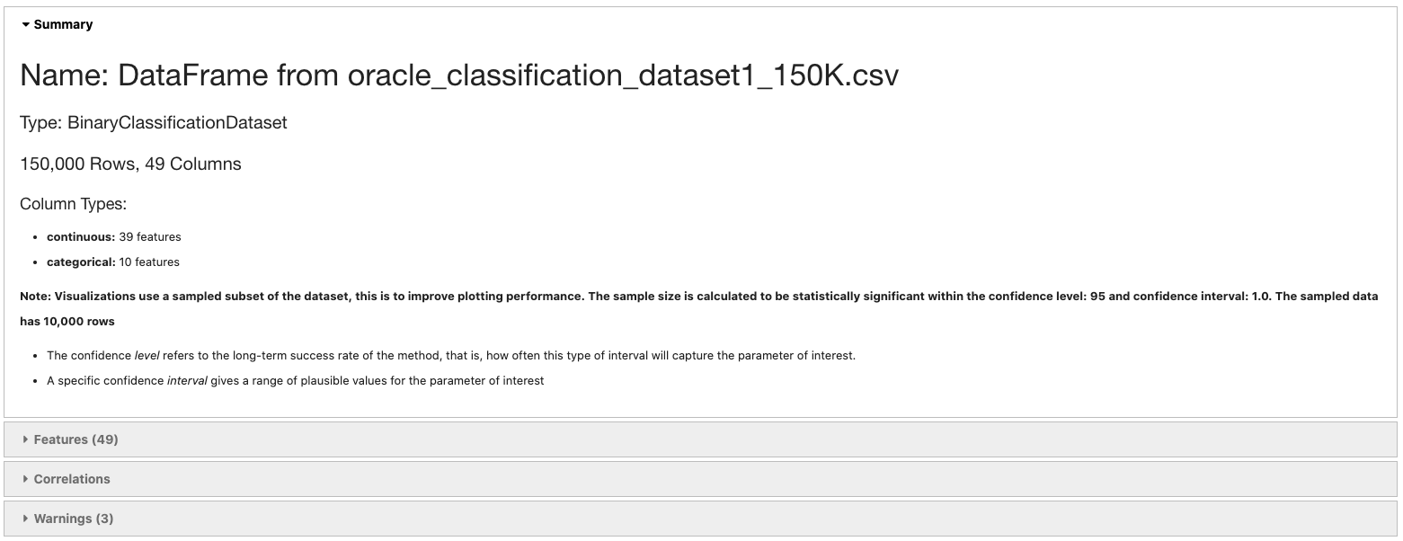
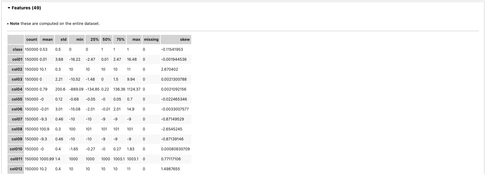
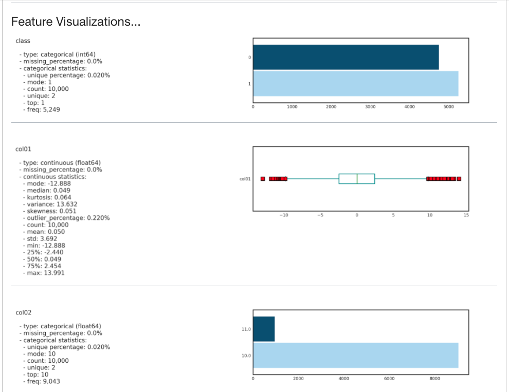
The ADS show_in_notebook() method creates a comprehensive preview of all the basic information about a dataset including:
The predictive data type (for example, regression, binary classification, or multinomial classification).
The number of columns and rows.
Feature type information.
Summary visualization of each feature.
The correlation map.
Any warnings about data conditions that you should be aware of.
To improve plotting performance, the ADS show_in_notebook() method uses an optimized subset of the data. This smart sample is selected so that it is statistically representative of the full dataset. The correlation map is only displayed when the data only has numerical (continuous or
oridinal) columns.
ds.show_in_notebook()
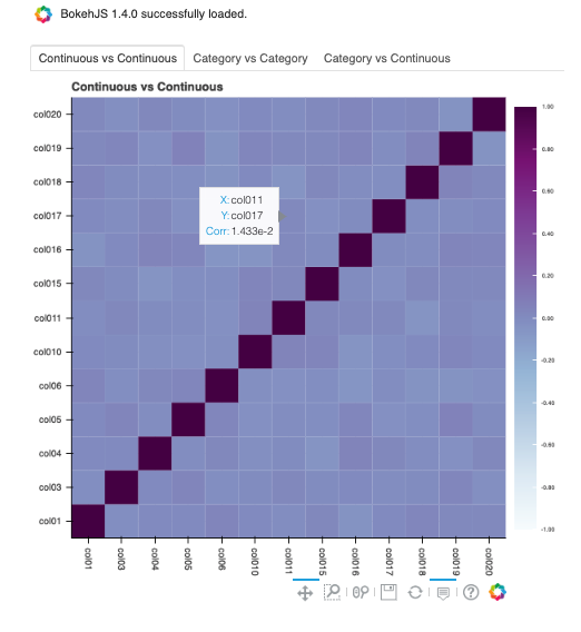
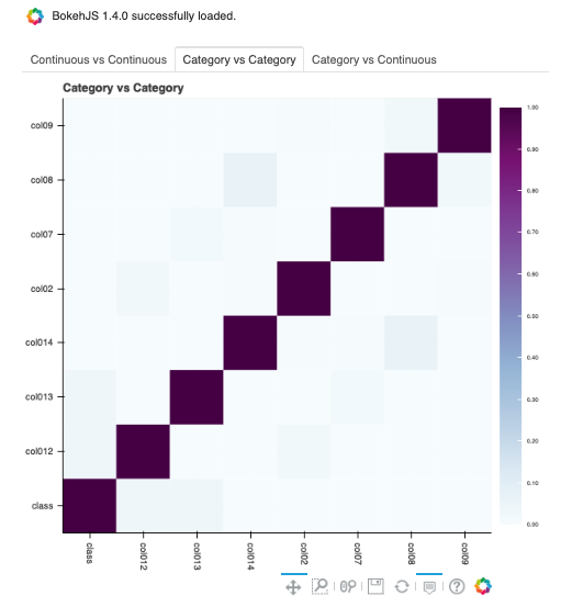
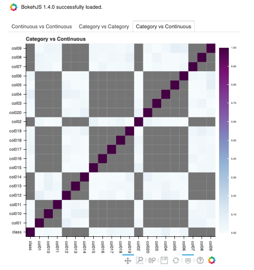
To visualize the correlation, call the show_corr() method. If the correlation matrices have not been cached, this call triggers the corr() function which calculates the correlation matrices.
corr() uses the following methods to calculate the correlation based on the data types:
Continuous-Continuous:
`Pearsonmethod <https://en.wikipedia.org/wiki/Pearson_correlation_coefficient>`__. The correlations range from -1 to 1.Categorical-Categorical:
`Cramer's Vmethod <https://en.wikipedia.org/wiki/Cram%C3%A9r%27s_V>`__. The correlations range from 0 to 1.Continuous-Categorical:
`Correlation Ratiomethod <https://en.wikipedia.org/wiki/Correlation_ratio>`__. The correlations range from 0 to 1.
Correlations are displayed independently because the correlations are calculated using different methodologies and the ranges are not the same. Consolidating them into one matrix could be confusing and inconsistent.
Note
Continuous features consist of continuous and ordinal types.
Categorical features consist of categorical and zipcode types.
ds.show_corr(nan_threshold=0.8, correlation_methods='all')
By default, nan_threshold is set to 0.8. This means that if more than 80% of the values in a column are missing, that column is dropped from the correlation calculation. nan_threshold should be between 0 and 1. Other options includes:
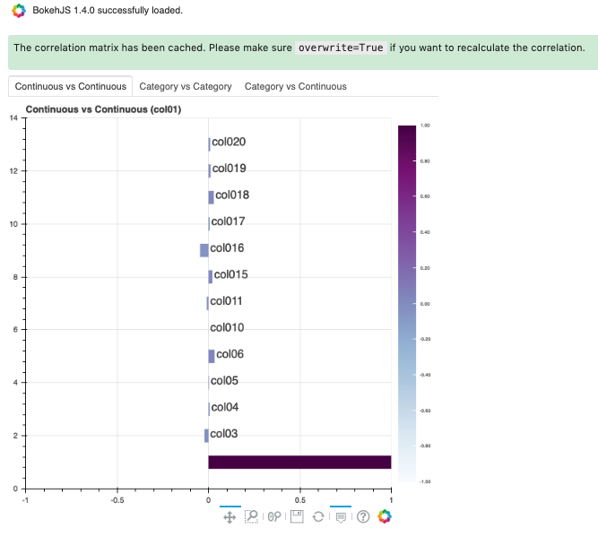
correlation_methods: Methods to calculate the correlation. By default, onlypearsoncorrelation is calculated and shown. Can select one or more frompearson,cramers v, andcorrelation ratio. Or set toallto show all correlation charts.correlation_target: Defaults to None. It can be any columns of typecontinuous,ordinal,categoricalorzipcode. Whencorrelation_targetis set, only pairs that containcorrelation_targetdisplay.correlation_threshold: Apply a filter to the correlation matrices and only exhibit the pairs whose correlation values are greater than or equal to thecorrelation_threshold.force_recompute: Defaults to False. Correlation matrices are cached. Setforce_recomputetoTrueto recalculate the correlation. Note that bothcorr()andshow_corr()method can trigger calculation of correlation matrices if run withforce_recomputeset to beTrue, or when there is no cached value exists.show_in_notebook()calculates the correlation only when there are only numerical columns in the dataset.frac: Defaults to 1. The portion of the original data to calculate the correlation on.fracmust be between 0 and 1.plot_type: Defaults toheatmap. Valid values areheatmapandbar. Ifbaris chosen,correlation_targetalso has to be set and the bar chart will only show the correlation values of the pairs which have the target in them.
ds.show_corr(correlation_target='col01', plot_type='bar')
To explore features, use the smart plot() method. It accepts one or two feature names. The show_in_notebook() method automatically determines the best type of plot based on the type of features that are to be plotted.
Three different examples are described. They use a binary classification dataset with 1,500 rows and 21 columns. 13 of the columns have a continuous data type, and 8 are categorical. There are three different examples.
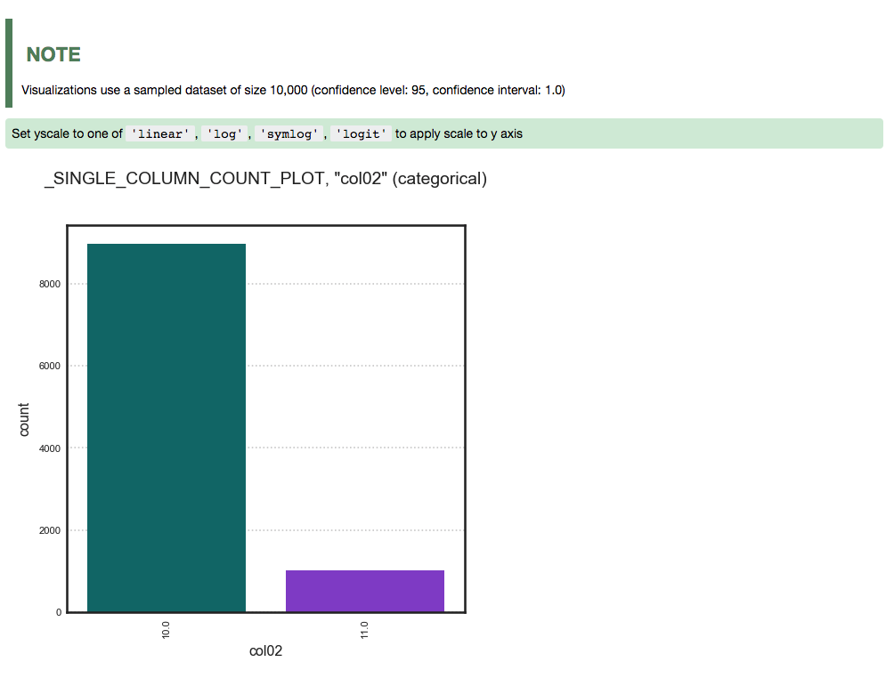
A single categorical feature: The
plot()method detects that the feature is categorical because it only has the values of 0 and 1. It then automatically renders a plot of the count of each category.ds.plot("col02").show_in_notebook(figsize=(4,4))
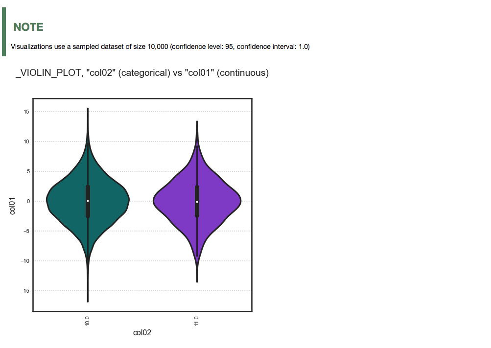
Categorical and continuous feature pair: ADS chooses the best plotting method, which is a violin plot.
ds.plot("col02", y="col01").show_in_notebook(figsize=(4,4))
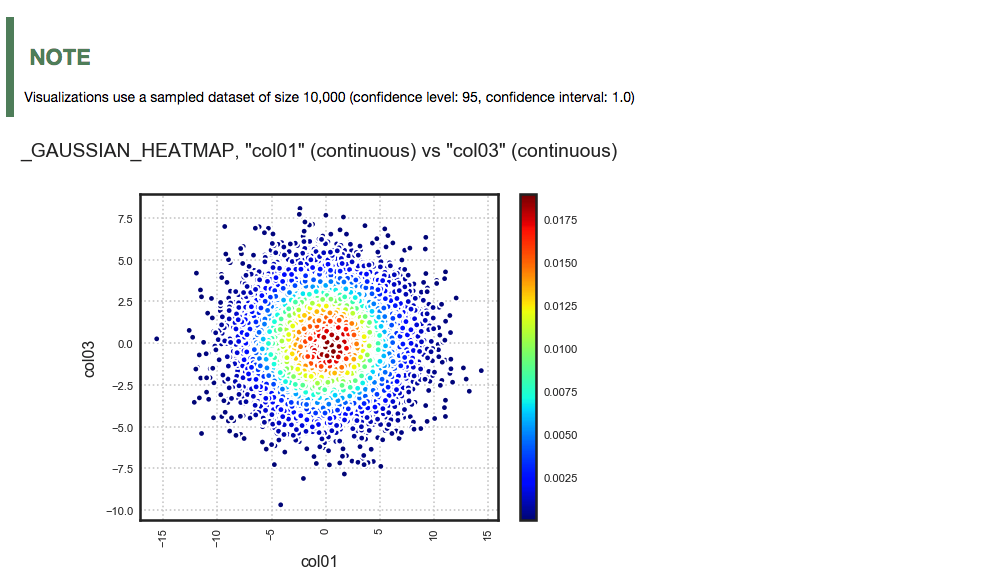
A pair of continuous features: ADS chooses a Gaussian heatmap as the best visualization. It generates a scatter plot and assigns a color to each data point based on the local density (Gaussian kernel).
ds.plot("col01", y="col03").show_in_notebook()
Customized
ADS provides intelligent default options for your plots. However, the visualization API is flexible enough to let you customize your charts or choose your own plotting library. You can use the ADS call() method to select your own plotting routine.
Seaborn
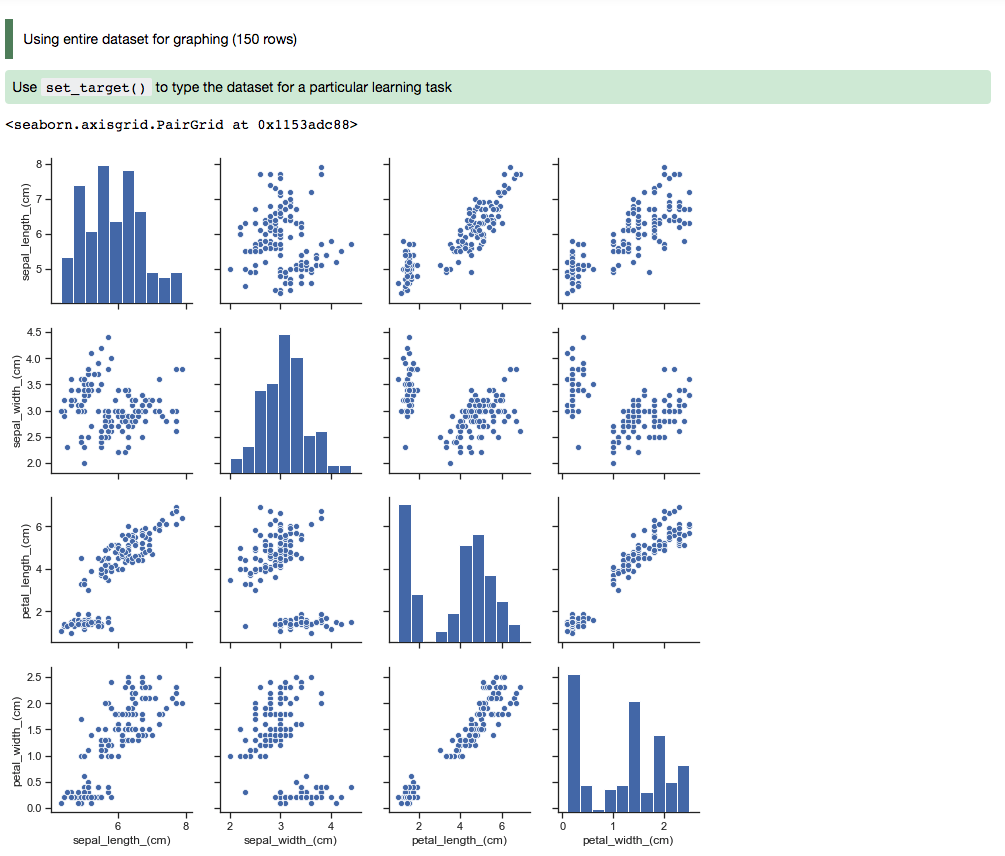
In this example, a dataframe is passed directly to the Seaborn pair plot function. It does a faceted, pairwise plot between all the features in the dataset. The function creates a grid of axises such that each variable in the data is shared in the y-axis across a row and in the x-axis across a column. The diagonal axises are treated differently by drawing a histogram of each feature.
import seaborn as sns
from sklearn.datasets import load_iris
import pandas as pd
data = load_iris()
df = pd.DataFrame(data.data, columns=data.feature_names)
sns.set(style="ticks", color_codes=True)
sns.pairplot(df.dropna())
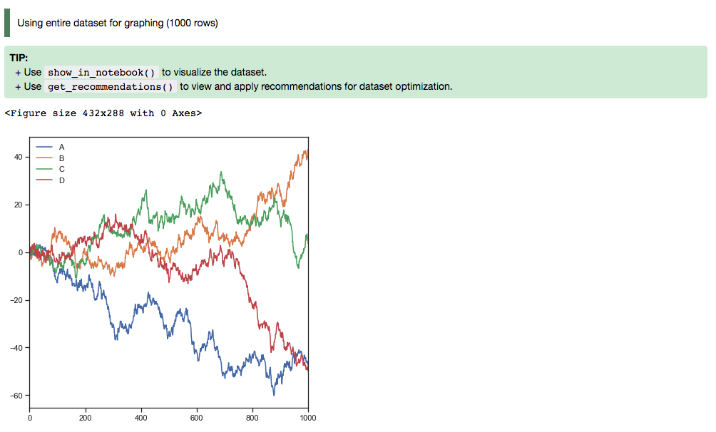
Matplotlib
Using Matplotlib:
import matplotlib.pyplot as plt
from numpy.random import randn

df = pd.DataFrame(randn(1000, 4), columns=list('ABCD'))

def ts_plot(df, figsize):
    ts = pd.Series(randn(1000), index=pd.date_range('1/1/2000', periods=1000))
    df.set_index(ts)
    df = df.cumsum()
    plt.figure()
    df.plot(figsize=figsize)
    plt.legend(loc='best')

ts_plot(df, figsize=(7,7))
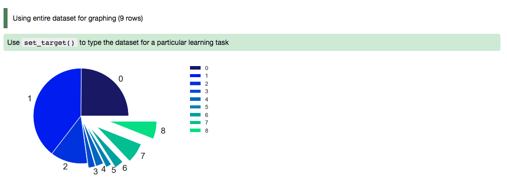
Using a Pie Chart:
import numpy as np
import pandas as pd
import matplotlib.pyplot as plt

data = {'data': [1109, 696, 353, 192, 168, 86, 74, 65, 53]}
df = pd.DataFrame(data, index = ['20-50 km', '50-75 km', '10-20 km', '75-100 km', '3-5 km', '7-10 km', '5-7 km', '>100 km', '2-3 km'])

explode = (0, 0, 0, 0.1, 0.1, 0.2, 0.3, 0.4, 0.6)
colors = ['#191970', '#001CF0', '#0038E2', '#0055D4', '#0071C6', '#008DB8', '#00AAAA',
        '#00C69C', '#00E28E', '#00FF80', ]

def bar_plot(df, figsize):
    df["data"].plot(kind='pie', fontsize=17, colors=colors, explode=explode)
    plt.axis('equal')
    plt.ylabel('')
    plt.legend(bbox_to_anchor=(1.05, 1), loc=2, borderaxespad=0.)
    plt.show()

bar_plot(df, figsize=(7,7))
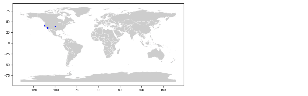
Geographic Information System (GIS)
This example uses the California earthquake data retrieved from United States Geological Survey (USGS) earthquake catalog. It visualizes the location of major earthquakes.
earthquake.plot_gis_scatter(lon="longitude", lat="latitude")